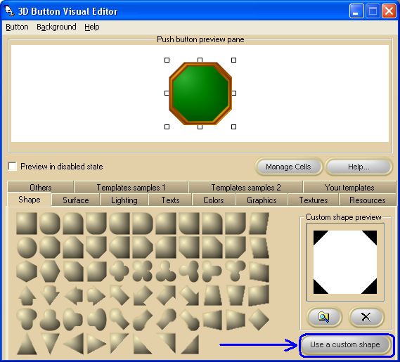
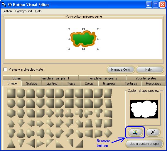
The custom shaped control is based on a mask that will determine the shape of the control: creating a mask is very simple because all you need is a picture file that can be easily created using an image editor. Here follows a little tutorial that will demonstrate how to proceed.
The first thing to do is to create a picture file, like the one you can see below, containing a bitmap that will be used as a mask for determining the button final shape.
Now, the procedure differs if you want to perform the operation at Design time or at Runtime
DESIGN TIME:
• | As displayed on the picture below, select the Shape tab and click the "Use a custom shape" button: this will enable the Browse and Delete buttons and, if no custom mask was previously loaded, the mask will default to a rectangle: |
• | Now simply load the picture file containing the mask bitmap you just created by pressing the Browse button and see the effect on the 3D button under editing: note that, by default, the button will be automatically resized to the actual size in pixels of the custom mask. |
RUNTIME:
• | Set the Shape property to Shapes.Custom (5) |
• | Set the PictureCustom property to the picture file containing the mask bitmap you just created. |
• | The mask bitmap can also be loaded using the SetPictureFromHandle method with the index parameter set to Pictures.Custom (3) |
|